Month: February 2018

Paper Inspiration – Port Wine Packaging

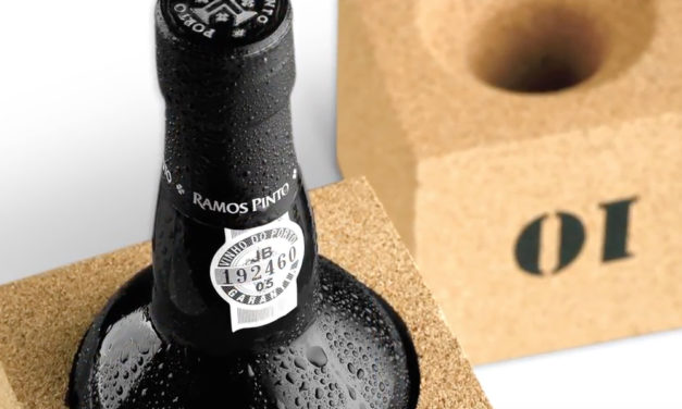
Designed and produced by Portugal’s Omdesign, this piece looks like a cross between a traditional liquor package and some hitherto unknown IKEA furnishing for fairies. Details are minimal but no less impressive for being so, particularly the blind deboss stamp beside the wine’s name. Yet what truly impresses, of course, is Omdesign’s novel approach to wine packaging sustainability. Not content to simply craft another box bound for the recycle bin, they’ve given it a second life as something that’s actually practical. It’s comprised of a pair of cork blocks and an outer sleeve of pressed cardboard that holds those...

Read More

Paper Inspiration – Experimenta Magazine 66

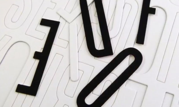
Interactivity is easily one of the biggest trends of the year when it comes to print, and something intriguingly demonstrated with this issue of Experimenta magazine. A Spanish journal covering art, architecture and technology, Experimenta (“Experience”) suspended its print edition with No. 65, switching to an online-only model for the next three years. It has since returned to print with each issue now dedicated to a single theme and designed by a different designer or studio. For Experimenta 66, the folks at Lavernia & Cienfuegos came up with a simple-yet-effective way of communicating that issue’s theme: “Do it yourself.”...

Read More

Paper Inspiration – Yesterday’s Headlines Beer

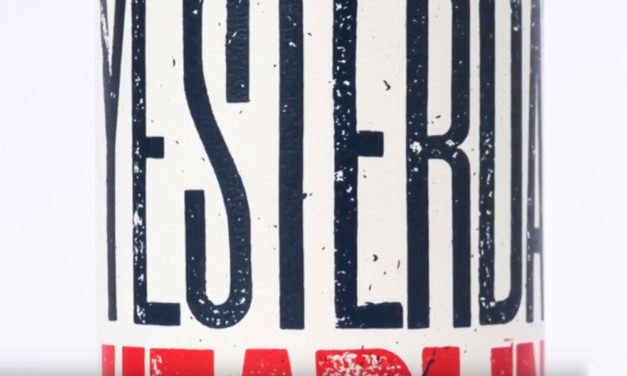
At a time when our culture lives, sleeps and breathes irony, it takes a lot to capture people’s attention with a winking, knowing smile. But hats off to Durham Brand & Co. who did it brilliantly with their packaging and labeling for Braxton Brewing Co.’s Yesterday’s Headlines Vol. 02 Cherry Kettle-Soured Ale. To start with, you’ve gotta love that name. The phrase, usually reserved for things (and people) deemed no longer relevant, here has a double meaning. First it refers to the beer that Braxton brewed over the previous year; it’s also an allusion to the stories printed on...

Read More

Paper Inspiration – Carousel Invitation

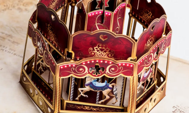
For the uninitiated, opera might seem a stale, stodgy affair better suited to some bygone era. But those who frequent and support the Houston Grand Opera know better. From its choice of operas to the way they are staged, it never fails to surprise. How apt, then, that the invitation for its 2016 Opera Ball fundraiser that was slipped unassumingly into select letterboxes throughout the city, opened to reveal something that sprang gloriously and unexpectedly to life. Crafted by Lavandula Design, the piece arrived in a distinctive oversize envelope boasting a parchment-like pattern and strikingly designed logo for the...

Read More
  • 1
  • 2