
IS MY LAMINATE FILM CAUSING COLOR SHIFT?
Laminates and films provide a whole host of benefits to printed media, from improved durability and structure to unique visual and haptic effects. As a finishing method, lamination invariably increases the value of printed sheets, prime labels, digital photographs, flexible packaging, and a huge range of other applications. However, as with any finishing process, printers will find that lamination can have some unintended side effects in terms of color accuracy.
In most situations, these issues are minimal and oftentimes go unnoticed by the human eye. Still, in especially sensitive jobs where a brand uses several types of print media, ensuring colors match is of utmost importance. After all, high-end brands want to ensure their products are instantly recognizable and maintain a consistent aesthetic whether their customers pick up a box, bottle, or pouch. If you’ve noticed variations in color before and after laminating a print, keep reading to learn about why color shift occurs and get some helpful tips on how to resolve the issue.
What Is Color Shift?
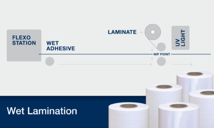
As stated previously, any finishing process that covers the surface of a printed piece will alter the appearance of the ink in some way. UV coatings, thermal laminates, and films applied via a wet adhesive will each have a different impact on how the PMS colors look once the print is finished. Color shift occurs when a color on a finished piece looks different than the customer’s intent due to the way light is diffused through the top laminate or coating. Sometimes, these laminates or coatings will also bias towards a particular color as a result of the materials they are made of.
Because color shift can include incredibly small discrepancies, printers don’t always need to alter their process in any significant way. Even when Delta E levels are less than ideal, the true test lies in how the brand views the end product. Certain brands will have less strict standards and instead prioritize cost or speed to market above all else. However, when color shift does matter to a brand, it is crucial for a printer to know how to address the issue and tweak their process so the final product matches the customer’s intent more closely.
What Is Delta E?
The term “Delta E ” is a combination of Greek and German. In mathematics, the Greek letter delta (Δ) is used to represent change. The E is short for “empfindung,” a German word meaning “sensation.” Therefore, Delta E (also represented as ΔE) literally translates to “change in sensation.” This standardized measurement was introduced by the International Commission on Illumination (CIE) in 1976 as a way to quantify the perceived differences between shades of the same hue. While it is frequently used to describe how accurate a digital display is to its input, in the printing industry, it is used to denote the degree of change between a print and the original color, whether that color comes from a proof or a physical object, such as a bottle cap, article of clothing, or even a person’s skin tone.
The Delta E scale ranges from 0 to 100, with 0 denoting that two colors are an exact match. While 0 Delta E might be what brands would like to achieve in their products, the truth is that modern printing technology is not capable of perfectly replicating colors in print with enough accuracy to get a 0 Delta E reading. With a few exceptions, the best printers can typically hope to reach when matching colors is a Delta E reading approaching 2; for certain colors, even this reading may prove to be impossible. Fortunately, most people can reliably observe differences in color only for readings above 3 Delta E, but especially sensitive eyes are more capable of spotting differences between less saturated colors.
Additionally, a Delta E reading alone isn’t enough to convey how two colors relate to one another. While Delta E always refers to the degree of difference between two colors, several different formulas have been created over the decades to better account for the way human eyes function. If the formula used to calculate the Delta E isn’t named, the measurement loses all context. For this reason, Delta E readings are often followed by the specific model used to calculate the measurement (e.g. 2.2 dECMC). Even our most modern formulas are still far from perfect, but they are continuously being improved as we learn more about how the human eye works.
It is crucial for printers to properly understand what Delta E readings represent so they can explain the color matching process to customers in a technical manner. While brands may be tempted to gauge the accuracy of a color merely by its appearance, printers should always stress the importance of trusting the math and relying on the Delta E readings from a well-maintained spectrophotometer to accurately measure improvements in color shift. This approach ensures all variables are accounted for and provides an objective, quantitative point of reference without relying on the human eye to judge how closely two colors match.
STRATEGIES FOR RESOLVING COLOR SHIFT
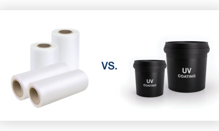
A customer who has traditionally used UV coatings on their prints may decide they want to switch to lamination to increase the performance or aesthetic value of their product. Knowing that color accuracy is critical for this customer and that the thicker laminate layer will increase color shift, how can a printer account for this change and ensure the new prints are as close to the customer’s original intent as possible? We’ll look at some strategies below.
Profile Your Press Fleet
Long before a printer encounters color shift on a live job, they should take active steps to account for the issue by color profiling each press in their operation. Also known as fingerprinting, this process creates a unique color profile for each permutation of ink type, substrate, adhesive, and film that could potentially be used on that press; this profile can then be used moving forward to account for color shift on any jobs that utilize that specific material combination. The number of profiles that need to be created will depend entirely on how many different types of materials a printer offers. A printer who only prints on white paper with a gloss or matte laminate may need just two profiles. Printers who utilize a wide range of materials may choose to limit themselves to a manageable number of profiles by grouping materials together and allowing room for variations in custom jobs.
To create a color profile that accounts for lamination, follow these steps:
- Begin by printing two copies of the press’s color chart. Set aside one chart to be used as a point of comparison.
- Laminate the other chart using the specific film and adhesive type that will be used on live jobs.
- Use a spectrophotometer to quantify the Delta E shift between each chart.
- With this data, your Raster Imaging Processor (RIP) software can create a profile with new values that accommodate for the expected color shift.
The color profiling process may need to be repeated several times to reach a suitable color match, but once it is done correctly, any print jobs using the material combination that was profiled will be able to instantly correct for the expected color shift. For instance, in cases where a laminate may cause a color to appear more yellow than it should, the software will account for this effect by making the initial print more cyan. The result should be colors that more accurately match a brand’s intention, although they will never match perfectly.
Testing the gray balance is crucial during this process because, as a neutral color, gray will immediately show if a press is correctly profiled and maintained. A press that can print the color gray without leaning towards another color is properly set up. The G7 method, which was developed by the chairman of the International Digital Enterprise Alliance (IDEAlliance) in 2006, enables printers to gauge the neutrality of printed grays and is an excellent way to achieve visual consistency across a range of processes. Because this method standardizes CMY percentages and provides specific values for each step, printers can follow the process manually across a broad range of press types.
Since the color profiling process is time intensive, it should always be done prior to live jobs as part of the regular color management and maintenance of your press fleet. Using press proofs can allow you to match simulated colors very quickly without having to do a custom fingerprint every time, but some printers charge a fee for this service. Ultimately, the goal of generating multiple color profiles is to minimize color shift between different permutations as jobs go to press. Coatings and laminates will always cause color shift to varying degrees, but a knowledgeable printer can account for this by being prepared.
Isolate the Issue
When a specific material combination begins displaying color shift despite previous runs being accurate, it can be easy to assume that the root cause of the problem is the quality of the laminate or film being used. While film quality can certainly account for some errors, oftentimes the culprit is something tangential to the laminate itself. Be sure to look at each component in the process, from the adhesive being used to the calibration and status of the equipment. Chemistry and environmental factors can affect how inks, adhesives, and films interact and create quality issues even when each component is functioning as it should on an individual level.
Regular press maintenance is key. Cleaning the anilox rollers on a flexographic press, ensuring tolerances are tight on the print deck, and checking that inks are curing properly and being disposed of past their expiration dates are all crucial preventative steps in minimizing color shift and speeding up the troubleshooting process. By habitually taking the time to evaluate the print processes, print equipment, chemistry, and other variables at play, a printer can quickly solve for color shift while gaining vital information that will streamline future jobs.
Understand Material Properties
Every film has its own unique set of characteristics that can impact color, and understanding why certain products perform better in this regard than others will improve the outcome of future print jobs. By nature, films and laminates are thicker than energy-cured coatings and will have a greater potential impact on color accuracy. Lamination provides superior protection and durability, so these slight shifts are often accepted as a necessary byproduct in high-value products. Still, even different laminations, materials, thicknesses, and finishes can have an impact on how noticeable color shift is.
In terms of material compositions, biaxially oriented polypropylene (BOPP) is often thin with high clarity, making it an excellent choice for projects where clarity is of primary importance. Polyester (PET) is stiffer and known to be more durable, with some thicker variations being more prone to color shift. Cellulose (CLS) films are made from a bio-based material, which makes them excellent for plastic reduction; however, they tend to have a yellowish tint that can affect color accuracy. Each printer should have a clear grasp of these different materials so they can weigh the importance of durability, sustainability, and color accuracy when selecting a laminate – knowing, of course, that color profiling can always be used to correct any resulting color shift.
Finishes can also have a significant effect on color. While gloss is an excellent finish for making sure printed colors remain accurate, a matte finish reduces the intensity of chroma, or saturation, giving the printed design a more muted look. This effect is typically what people want in a matte finish, but it can also impact the accuracy of lighter colors. Some specialty laminates have a coating that may cause color shift, which can complicate matters when a color-critical brand also wants the haptic appeal of Karess® soft touch or the durability of scratch-resistant ScuffProof®. In these instances, the printer may need to have an open dialogue with the brand about the properties and limitations of certain laminates within their given color profiles.
Accept That Colors Will Sometimes Vary
The simple truth is that no matter which materials or processes are used, printed designs will always look different in different settings. It would be impractical for a color management system to account for every potential variation in lighting or environment a print could be exposed to, which is why proofing booths are often used as a location for signing off on designs. These booths enable the printer and brand representative to meet in a neutrally lit location instead of an office with fluorescent lights. Once the printed media leaves the production floor, it will invariably be exposed to a variety of lighting, from office buildings and retail stores to outdoor settings and residential homes.
Lighter tints of colors are more susceptible to observable color shifts in different lighting because they are more affected by the reflection of light, which affects our perception of the color. Ultimately, the human eye is not as reliable as the objective readings of a spectrophotometer when it comes to different light sources. Even when several people are in the same room looking at the same print, each may view the colors differently due to differences in their eyes. So long as a printer does their due diligence and accurately matches the finished piece with the original color they were given, brands should accept that color consistency will vary based on the environment the print is placed in.
WANT TO KNOW MORE?
If you’re still curious about how to combat color shift or want to know more about color science in the printing industry, reach out to us via phone or email. Our dedicated solutions experts have years of experience in prepress and know lamination inside and out. They would love to speak with you regarding any questions you may have about how to make sure you produce premium prints that satisfy your customers every time.