
In the printing world, having more colors to design with may seem like a better choice. However, many self-made graphic designers these days seem to lack the understanding of the importance of printing their materials in CMYK mode, as opposed to using the RGB format. Why does the variation matter? It’s all about the differences in mediums, and their individual uses of darkness and light as sources for portraying color.
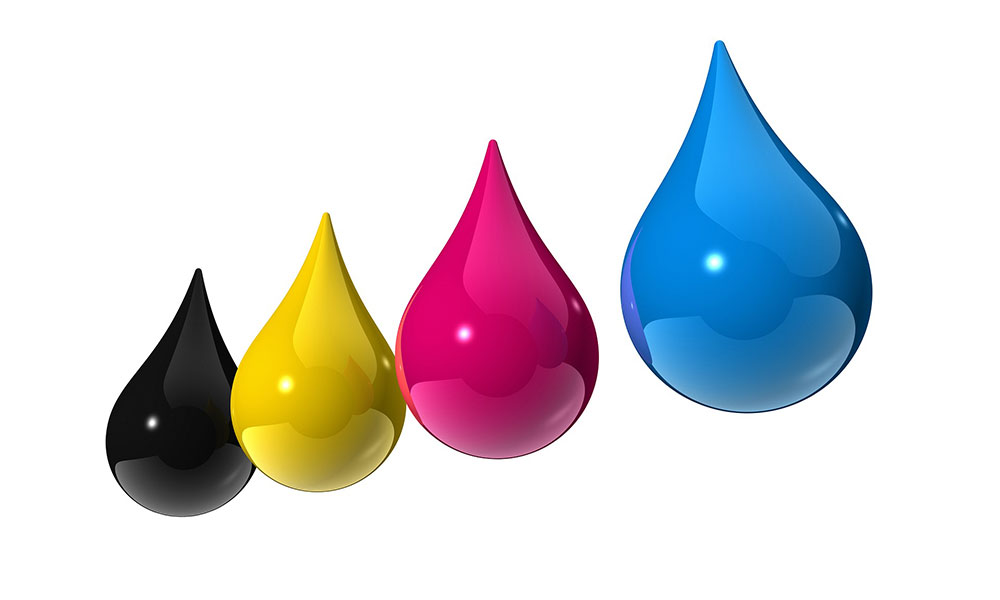
To start, let’s explain the difference between CMYK and RGB colors. RGB stands for “Red, Green, Blue,” the colors often used for television sets and computer monitors to emphasize thousands of various colors. CMYK, on the other hand, stands for “Cyan, Magenta, Yellow, Black,” the basic color scheme used for printing, from larger business companies down to the everyday home printer.
So why does the distinction matter? RGB are the colors of “light,” while CMYK are the colors of “darkness,” which means that CMYK colors can appear on paper more accurately without a light source, as opposed to RGB colors which require a light source to appear accurately on screen. Light shining on a piece of printed material is not reflected in the same way it’s revealed on screen. Therefore, printed items need a different variation in colors to correctly signify the intended look the designer is trying to achieve.
As a tried and true method for printing success, it’s best to start new design materials using the CMYK format. In Photoshop, the CMYK “mode” can be applied even before work begins, leaving no one in the dark about how a piece will be represented on paper after printing takes place.


