
Looking back many years to when I first started in graphic design, I recall how black turned out to be the most perplexing of all the colors. Frankly, this came as a surprise because it seemed to me that it should be the most simple. Just hit the Black button and you have black right? Well it turned out I was quite wrong, and this cost me some money and caused me some embarrassment.
I had designed a beautiful luxury mailer for a client which was mostly black + images. The proofs from the printer looked great (done digitally), and my client happily signed off. But when the final run (printed using the four-color process) was delivered, I was the first person to get a call they were disappointed and rightly so. The black was washed out and had a slightly reddish hue that looked particularly pathetic when compared side-by-side with the original proof. What to do? I called the printer who blamed it on my file (of course), so I asked why I hadn’t been informed that there was an issue pointing out how great the original digital proof had looked. They had one of their art room people connect with me, and this is what I learned…
We should all know by now that RGB documents are meant for screens, and CMYK documents are meant for printing. Therefore, when you print a CMYK document, and you need a really rich black it’s important to remember one thing: 100% K is not the blackest black!!! (100% K is what Adobe products default to when black is selected). Yes, it does appear black on the screen, but this doesn’t necessarily make it so -as too many of us have learned with less-than-true black printing.
To obtain a true black, you must set CMYK to the following colors:
Most used
C-75 M-68 Y-67 K-90
The reason none of the values are set to 100% is to avoid having the printing end up muddy looking. As a disclaimer, always be sure to check with your printer as to how to produce the best blacks possible. For example Premier Printing, the company we use for printing uses C-60 M-40 Y-40 K-100. Another company uses 75% Cyan, 40% Magenta, 40% Yellow, and 100% Black. Generally, if your values are set within 7%, your results will be fine.
In spite of all of this, there are still variables, and variations in print runs still occur using the correct black. However, I have discovered a new secret weapon that ensures absolute black…consistently so!
A Breakthrough for me! The Richest and Most Consistent Black…
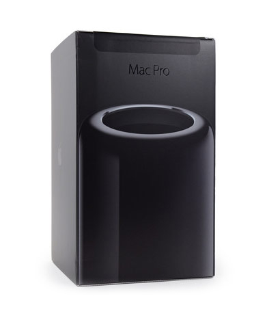
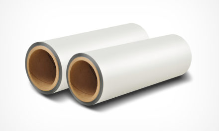
A very simple solution – black laminate film. Yep – there I said it. After discovering that black laminate could be printed on , I soon realized my black grievances were ended. By using films like Luxefilms® Ebony Karess™ (my personal favorite) guarantees the rich black of my dreams every time with no run-to-run inconsistencies. Because the film can be printed on, there are no graphic restrictions aside from your imagination (think foil effects, gloss and matte, etc).
“Needless to say, I have discovered a new secret weapon that ensures absolute black and consistently so!”
So thank you black laminates! My life is no longer fifty shades of gray.
