
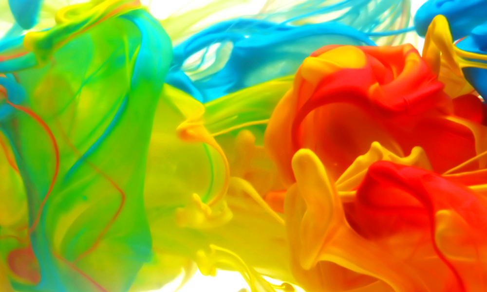
Packaging color is one of the most influential factors affecting how consumers perceive a product thus, affecting buying behavior. Color has been known to form a mood and influence sensory feelings amongst consumers.
Every color — primary and secondary — has its own emotional connection, providing the easiest way to attract consumers. As explained by Jenn David Connolly, “Color influences consumers not only on the conscious level, but also on the subconscious level”. WebpageFX marketing specialists stated that “consumers make a subconscious judgment about a product in sixty seconds or less of viewing it, and sixty-two percent to ninety percent of the consumers base the assessment solely on color”. Eighty-five percent of consumers say that color is the determining factor when choosing a certain product, because color registers faster than text or graphics in relation to consumer packaging and first impressions. By understanding the psychological connections of colors, businesses can increase their company branding effectiveness, especially as every color has correlating feelings and associations, setting the product tone and attracting their target consumers.
Red, one of the primary colors, is seen as a powerful hue. Red is known to stimulate and excite, increasing nerve impulses, thus increasing heart rates. Further, red has been understood to increase appetite and as the brain releases neurons because of hunger, to stimulate a physical response. This is why the color red is used to represent many food/beverage companies such as McDonald’s, Chick-fil-a, Red Robin, and Coca-Cola. However, red is also commonly used for other establishments where a physical response is key to purchasing, such as Target, K-Mart, CNN, and H&M. The key is for the consumer to associate the red logo with a powerful company but also to see the package and be stimulated to buy.
“Red is known to stimulate and excite, increasing nerve impulses, thus increasing heart rates.”
The second primary color, yellow, screams personality and emotion and is seen to increase cheerfulness and give a feeling of warmth. It stimulates mental processes and nervous systems, which could be why it is known to make babies cry and cause fatigue/strain to the eyes. Yellow is the color that the brain processes the fastest, making it attention-grabbing, and when you look at it, the brain releases serotonin (the ‘feel good’ chemical), causing you to feel good about what you are buying. Red and yellow together therefore, evoke taste buds and stimulate the appetite, which explains why companies like McDonalds, Burger King, Pizza Hut, and KFC have method in their color madness.
The final primary color is blue, which is related to trust, honesty, and dependability, and hints of water and freshness. This is why the color blue has been associated with calmness and serenity and as a constant in human life — the sky and the ocean being blue. Blue is widely used in product packaging — firstly because it is considered the most unappetizing color, but secondly because it creates a sense of security and trust. Many food packages do not use blue because it suppresses appetite and reduces hunger. Think about it, apart from blueberries, it is almost non-existent in natural foods. A 1970s study supports this, showing that customers reported a loss of appetite and even illness when served steak that was dyed blue with food coloring, despite it being completely edible. Because of this, it is used in low-calorie options such as Weight Watchers and other diet brands. However, non-food companies use blue in their packages and branding because it is known to create a sense of trust but also because it is associated with productivity and is seen as non-invasive. Businesses such as Lowes, Ford, Dell, GE, and Walmart all use blue as a key part, not only of their logo, but also their packaging.
However, using secondary colors stimulates ‘mixed consumer emotions’. Orange, a blend of red and yellow, is representative of both colors’ psychological correlations. In packaging, orange signifies aggression and creates a call to action, either to buy or subscribe, making it key to capturing impulsive shoppers. However, it is also a youthful color that relates to creativity signifying a friendly, cheerful and confident brand. This is why companies such as Amazon, the largest retailer in the world, uses orange for their packaging, as it denotes a business with good customer service, but also one that sparks impulsive buying.
“Green is another secondary color, known to represent health, tranquility, nature, and well-being.”
Green is another secondary color, known to represent health, tranquility, nature, and well-being. This is why many companies, if environmentally-friendly, make their packages green as it displays that they are ecologically considerate. In the food industry, green represents natural, organic, and fresh options – promoted by companies like Subway, Tropicana, Whole Foods, and Starbucks, who use green on their packaging and as their brand color. When persons feel these correlations, even subconsciously, it creates that specific emotional consumer appeal.
Purple is linked with royalty, wealth, success, and wisdom, a color that is often found on products to reflect these emotions, by companies such as Cadbury and Crown Royal. It tends to soothe or calm — we all eat chocolate or drink when we are angry, stressed, or depressed — and symbolizes a creative, imaginative, and wise brand. This is reflected in Cadbury’s fun packaging with metallic spots and funny characters and Crown Royal’s distinguished purple bag and fun-shaped bottle.
White is used in packaging by companies aiming to convey simplicity and purity. Since white packages seem to make people think that they don’t include many ingredients, it is popular for packaging white-colored products such as milk, soft cheeses, yogurt, and cream. White signifies appropriateness and also cleanliness, as used by hygiene companies such as Dove. Many consumers want fresh products that are simple and clean, implying or confirming the point of no additives or processing. If this is a company’s selling point, they need to capitalize on this, hence, making their package white to subtly hint at wholesome goodness.
“Black is used to create a sense of luxury, sophistication, and to show increased value and quality.”
Lastly, black is used to create a sense of luxury, sophistication, and to show increased value and quality. For instance, Nobelus, the company I am associated with, has a specialty line of films – LuxeFilms – which is our luxury line of products. To represent this, we utilize black packaging with hints of gold and silver — signs of luxuriousness — displaying a high-value product image. Black is also used by Jack Daniels, a fine liquor manufacturer who presents their product as the best-quality whiskey at the best value. Similarly, Johnny Walker also does this to showcase their premium line of spirits – Johnny Walker Black Label. Black denotes wealth and quality, and some companies may want to charge more than their competitors for very similar products. Forming a mental image in a consumer’s mind by luxurious packaging helps to change a mindset: Yes, the product is a luxury of high quality. The appropriate packaging therefore allows the firm to charge more as is the consumer views it as worth more.
The importance of firms recognizing these color associations for effective packaging and its impact on consumers is key to reaching the right target markets and sending the right message about a brand. WebpageFX says, “Perhaps no choice is as vital to marketing as color. Whether you are selecting the color for a product package or for your email marketing campaign, color has tremendous impact on all of us. Subconsciously, we associate different colors with different things.” So knowing whether your packaging is effectively representing your brand values is important, especially as 62% to 90% of consumers base their first ninety-second visual impression solely on color. However, packaging color is not the only key to ensuring that consumers choose your product: Shape, logo, and typography all affect the way first impressions are made.
Different packaging shapes also give different first impressions. According to Phase 1 Prototypes, uniquely shaped packages provide the first indication that your product has a USP – unique selling point. Think of the Fiji water bottle, one of the only square-shaped water bottles. Automatically there is something unique about that water, inducing consumers to buy it – “Is their water that much better and that different too?” However, even a package’s linear shape has an immediate effect on consumers. Studies have shown that a package with a cusp shape is likely to “show fear, caution, or intimidation” and even some degree of harshness. Of course, not all products are linked to this; however, packages with curved edges reflect softness and comfort.